Recently some diversity stats have been circulated around the College of Idaho, and as new Idahoan I wondered about the general diversity (or lack thereof) in Idaho. I remembered seeing this post a while back about mapping in R, so I went to work.
Shapefiles
First, we need shapefiles for both the Idaho country boundaries and census tracts, which will give finer detail for data. These can be downloaded from the [US Census Bureau] (https://www.census.gov/geo/maps-data/data/tiger-cart-boundary.html). Under the “State-Based” files, get census tracts and country subdivisions, these will give you zip files for the state you’re interested in: census shape zip and census country.
The zip files need to be extracted, and then we can load the data into R and prep it for ggplot. The fortify commands produce a dataframe from the shapefile data the we can use with GGPlot2.
#packages needed:
library(ggplot2)
library(dplyr)
library(rgdal)
library(ggmap)
library(scales)

#load and prep shapefiles
tract <- readOGR(dsn="../../static/files/shape/", layer="cb_2016_16_tract_500k", verbose = FALSE)
tract <- fortify(tract, region = "GEOID")

county <- readOGR(dsn="../../static/files/shape/", layer="cb_2016_16_cousub_500k", verbose = FALSE)
county <- fortify(county, region = "COUNTYFP") #using GEOID gives census tract division
Now we’ve got our shapefile data, we need some demographic data to produce more than just empty maps.
American Community Survey
A great source of demographic data is the American Community Survey from the US Census Bureau. I already had the county and census tract ACS 2015 data from Kaggle. When loading the data, change the CensusTract variable to a character because of the encoding of the Kaggle version, otherwise there will be NA for all of Idaho’s census tracts!
library(readr)
IDacs2015 <- read_csv("../../static/files/acs2015_census_tract_data.csv",
                      col_types = cols(CensusTract = col_character())) %>%
  filter(State == "Idaho")
Mapping the Data
Now that we have geographic and demographic data loaded, we can combine it to produce some maps. There’s a fairly large amount of data in the ACS, for this post I’m going to focus on a few items: gender, racial diversity, and income.
Idaho Gender Map
Let’s build a map of Idaho with each census tract colored according to the percent of it’s population that is men (sorry LGBTQ fans, the ACS gender data is old school binary men/women).
#remove extra data,
IDacsM <- transmute(IDacs2015, id=CensusTract, pctMen = Men/TotalPop)
MplotData <- left_join(tract, IDacsM)

ggplot() +
  geom_polygon(data = MplotData, aes(x = long, y = lat, group = id,
        fill = pctMen)) +
    geom_polygon(data = county, aes(x = long, y = lat, group = id),
        fill = NA, color = "black", size = 0.25) +
    coord_map() + scale_fill_distiller(palette = "Blues", breaks = pretty_breaks(n = 10)) +
    guides(fill = guide_legend(reverse = TRUE)) + theme_nothing(legend = TRUE) + ggtitle("Percent of Population is Male")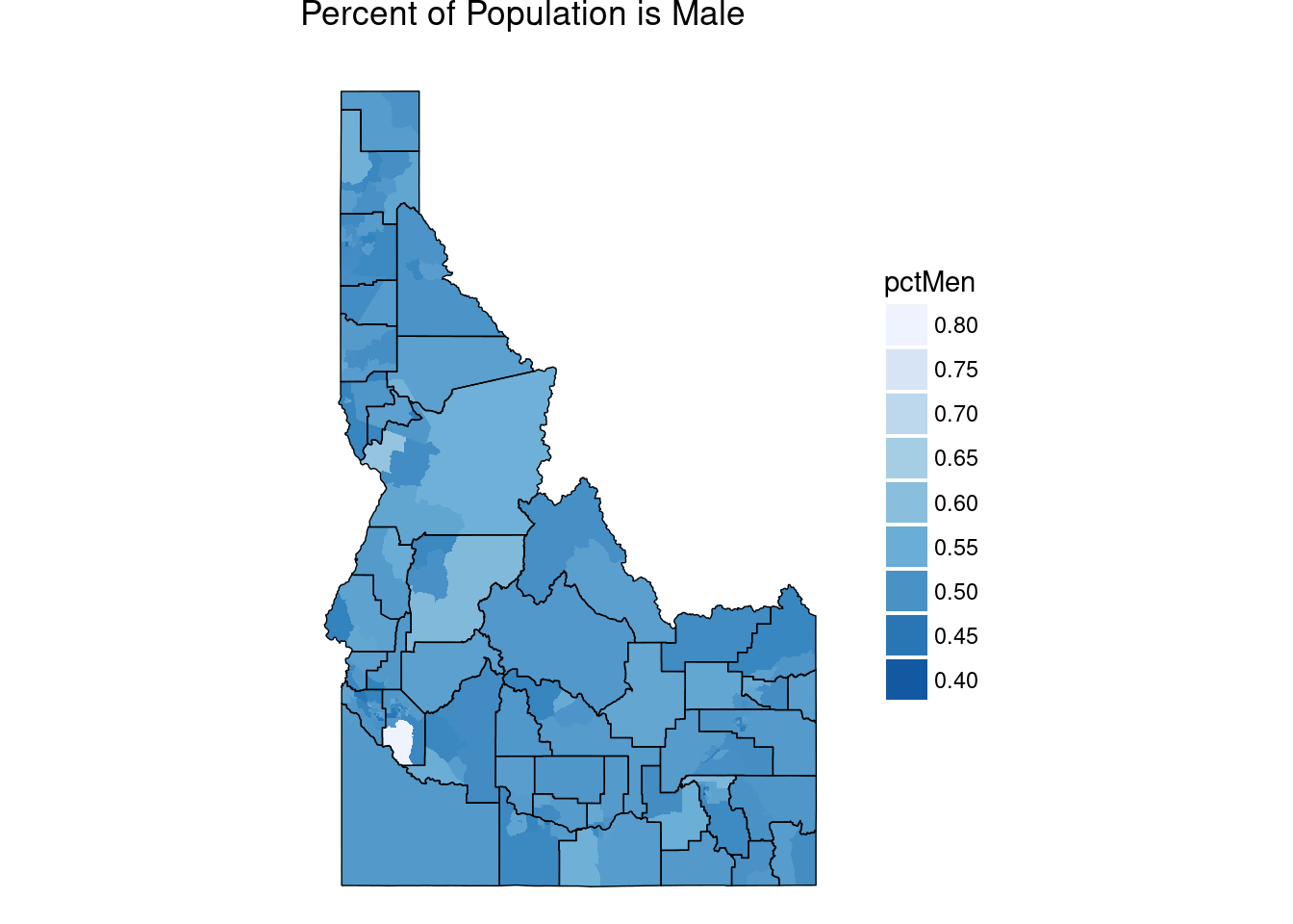
Notice that white chuck in south Ada county (where the capitol Boise is located). Is this a data anonmaly or is something else going on? Let’s investigate a bit.
whiteSpot <-MplotData[MplotData$pctMen > .70,]
wsMap <- get_map(location = c(left = min(whiteSpot$long),bottom = min(whiteSpot$lat), right = max(whiteSpot$long), top = max(whiteSpot$lat)), maptype = "satellite", zoom=11)
ggmap(wsMap)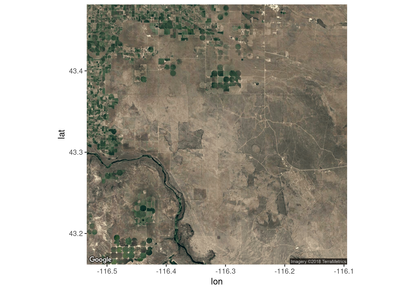 The empty expense is part of the Morley Nelson Snake River Birds of Prey National Conservation Area which doesn’t have any people living in it. Let’s zoom in on the top right area of the census tract, longitude -116.2 and latitude 43.5.
wsMapZoom <- get_map(location = c(lon = -116.23, lat = 43.48), maptype = "hybrid", zoom = 13)
ggmap(wsMapZoom)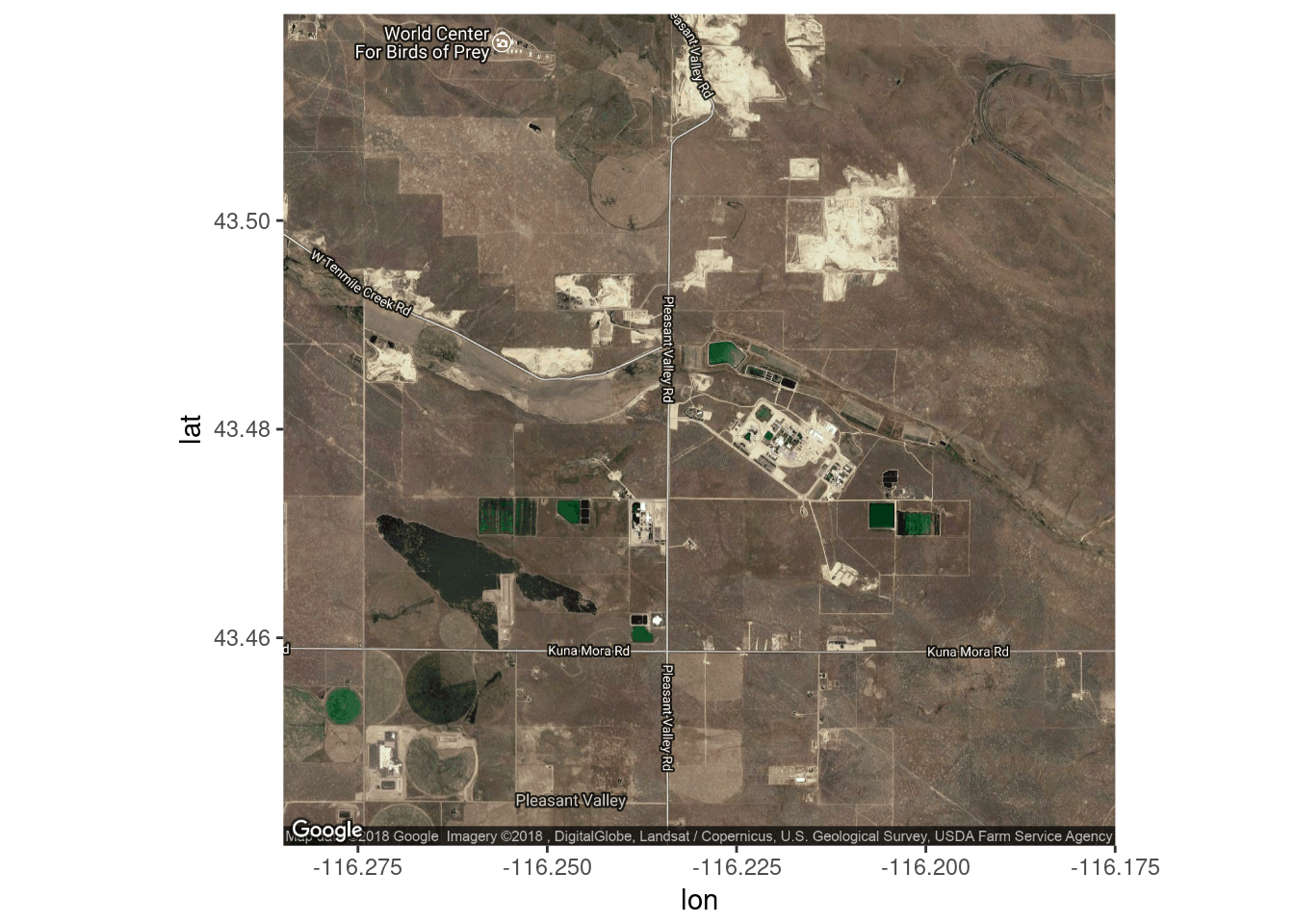 The buildings at \((-116.225, 43.48)\) are several correctional facilities and the smaller one on the other side of Pleasant Valley road is the state Women’s correctional facility.
The white chunck isn’t a data anomally. The includsion of a wildlife refuge and a mostly rural area make the census tract large. The presence of several men’s prisons dramatically skew the population.
Racial Diversity
Let’s build a similar map of the percent of the population that is white.
#remove extra data,
IDacsR <- transmute(IDacs2015, id=CensusTract, pctWhite = White/100)
RplotData <- left_join(tract, IDacsR)

ggplot() + geom_polygon(data = RplotData, aes(x = long, y = lat, group = id,
        fill = pctWhite)) +
    geom_polygon(data = county, aes(x = long, y = lat, group = id),
        fill = NA, color = "black", size = 0.25) +
    coord_map() + scale_fill_distiller(palette = "Reds", breaks = pretty_breaks(n = 10)) +
    guides(fill = guide_legend(reverse = TRUE)) + theme_nothing(legend = TRUE) + ggtitle("Percent of Population is White")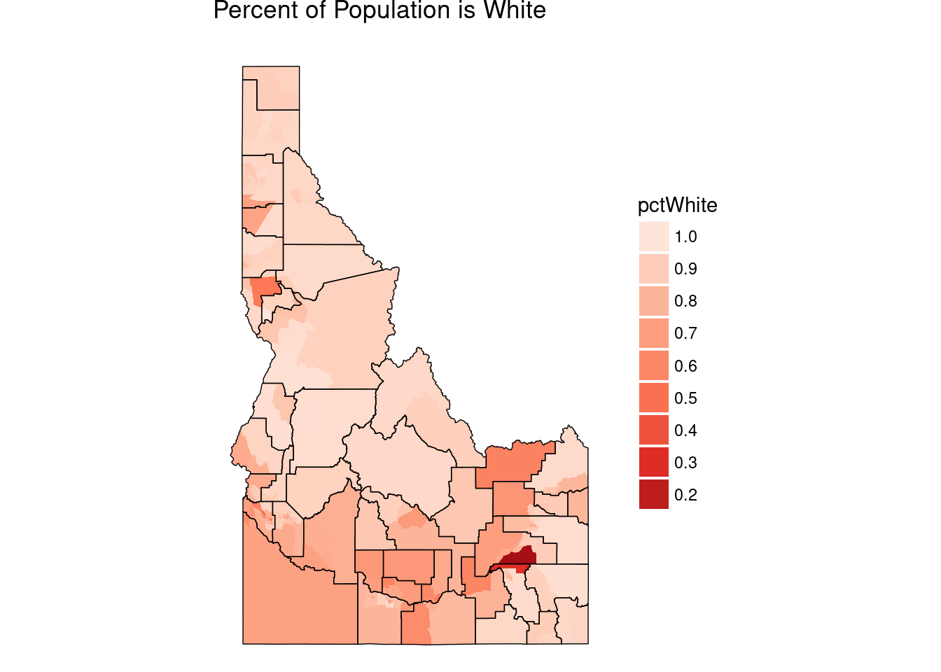
The bright red chuck on the border of Bingham and Bannock counties, with Pocatello on the southern edge, is the Fort Hall Indian Reservation. Not much else is surprising, Idaho is mostly white.
Per Capita Income
Lastly, let’s take a look at the per capita income.
#remove extra data,
IDacsI <- transmute(IDacs2015, id=CensusTract, IncomePerCap = IncomePerCap)
IplotData <- left_join(tract, IDacsI)
ggplot() + geom_polygon(data = IplotData, aes(x = long, y = lat, group = id,
fill = IncomePerCap)) +
geom_polygon(data = county, aes(x = long, y = lat, group = id),
fill = NA, color = "black", size = 0.25) +
coord_map() + scale_fill_distiller(palette = "Greens", breaks = pretty_breaks(n = 10), direction = 1) +
guides(fill = guide_legend(reverse = TRUE)) + theme_nothing(legend = TRUE) + ggtitle("Per Capita Income")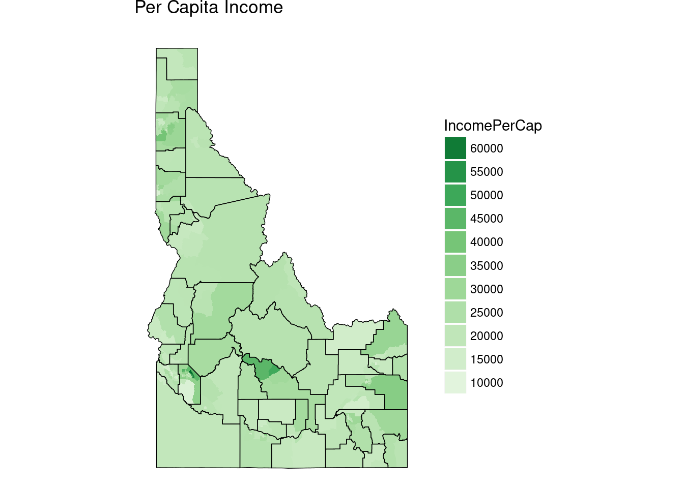 Notice the large dark green in the center of the state, that’s Sun Valley. There’s also a dark area in part of Boise.
This is just a glimpse of what’s in the ACS, I encourage you to play around some.