One of the classic assumptions of the linear regression models is that, conditioned on the explanatory variables, the response variable should be normally distributed. While teaching this the other day, I had a flash of insight into how to visualize this - ridge-line plots!
Data
I’ve been using Matloff’s Statistical Regression and Classification book, which uses the mlb dataset from his freqparcoord package. This has data on heights, weights, ages, positions, and teams of over 1000 major league baseball players. We’ll focus on just height and weight for now. Let’s load the packages we’ll need and the data and look at a simple scatter plot.
library(freqparcoord)
library(dplyr)
library(purrr)
library(ggplot2)
library(ggridges)
data(mlb)

ggplot(mlb, aes(x=Height, y=Weight))+
  geom_point(alpha=.2)+
  ggtitle("Heights and Weights of MLB Players")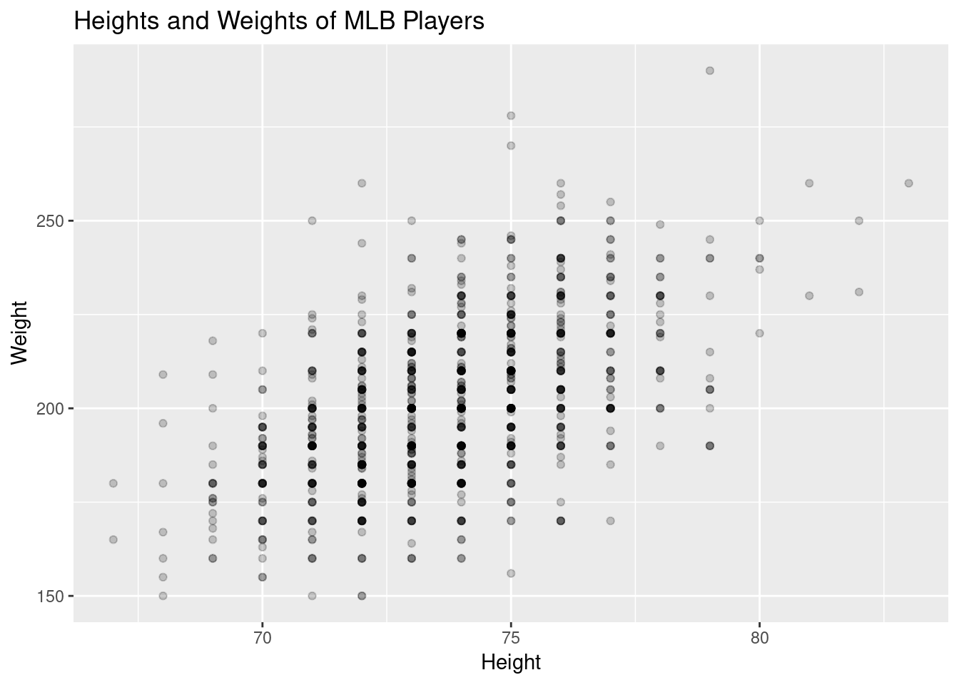
Because height is only measured to the inch, the data is naturally “grouped” which helps see the conditioning we’ll need.
First Try at Normality
The first thing I tried in class was to use a side-by-side boxplot that we had constructed earlier in the semester. This uses a familiar visualization to see the distribution of weights for each height - but even symmetric boxplots don’t ensure normality. Here’s the graph:
ggplot(mlb, aes(x=Height, y=Weight, group=Height))+
  geom_boxplot()+
  ggtitle("Boxplots of Weights for each Height of MLB Player")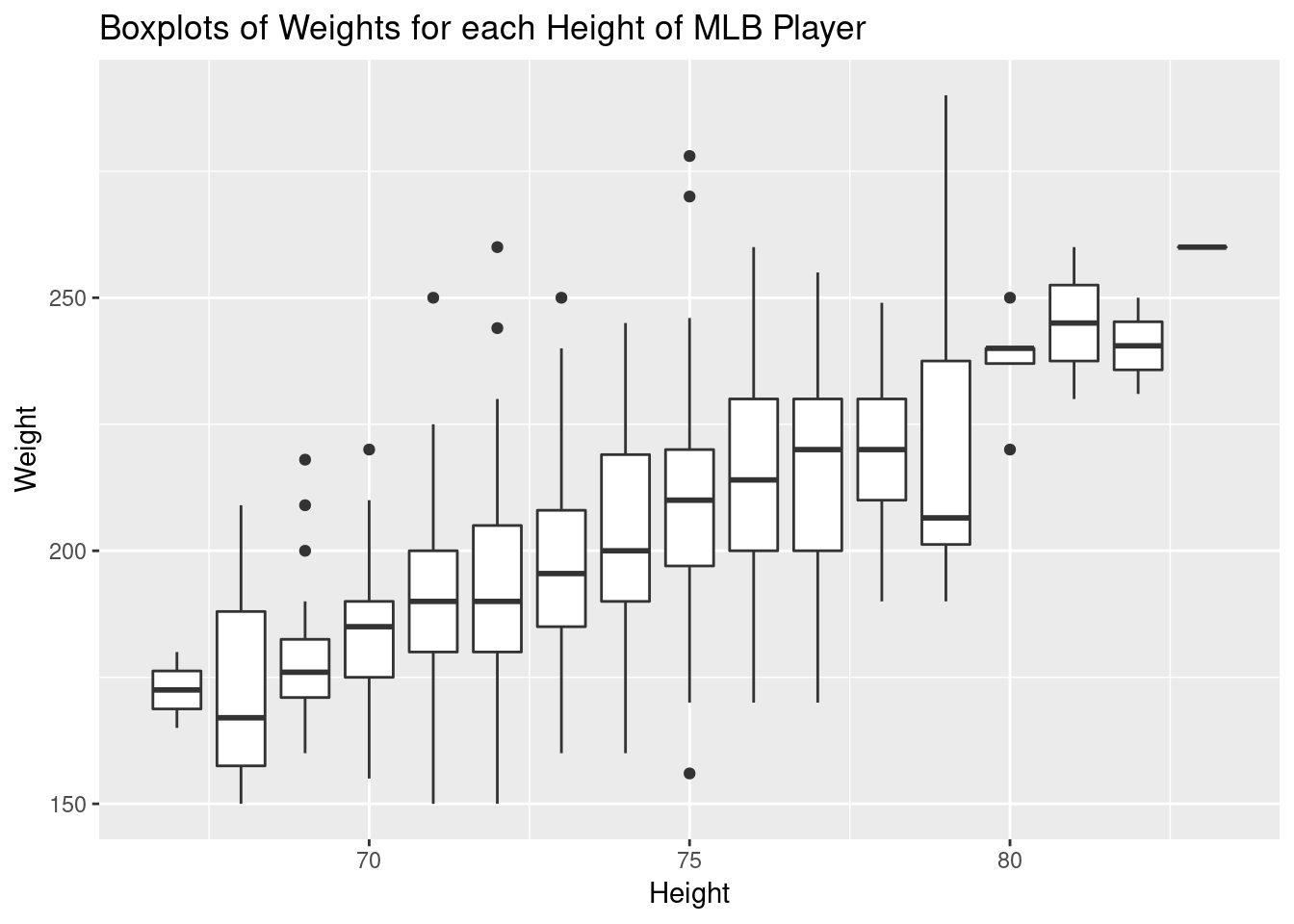
Second Try at Normality
While we were discussing the normality (or lack of it) in the boxplots, I thought about using a ridge-line plot so I brought this up in class:
ggplot(mlb, aes(y=Height, x=Weight, group=Height))+
  geom_density_ridges()+
  ggtitle("Ridgeline Plot of MLB Players Weights for each Height")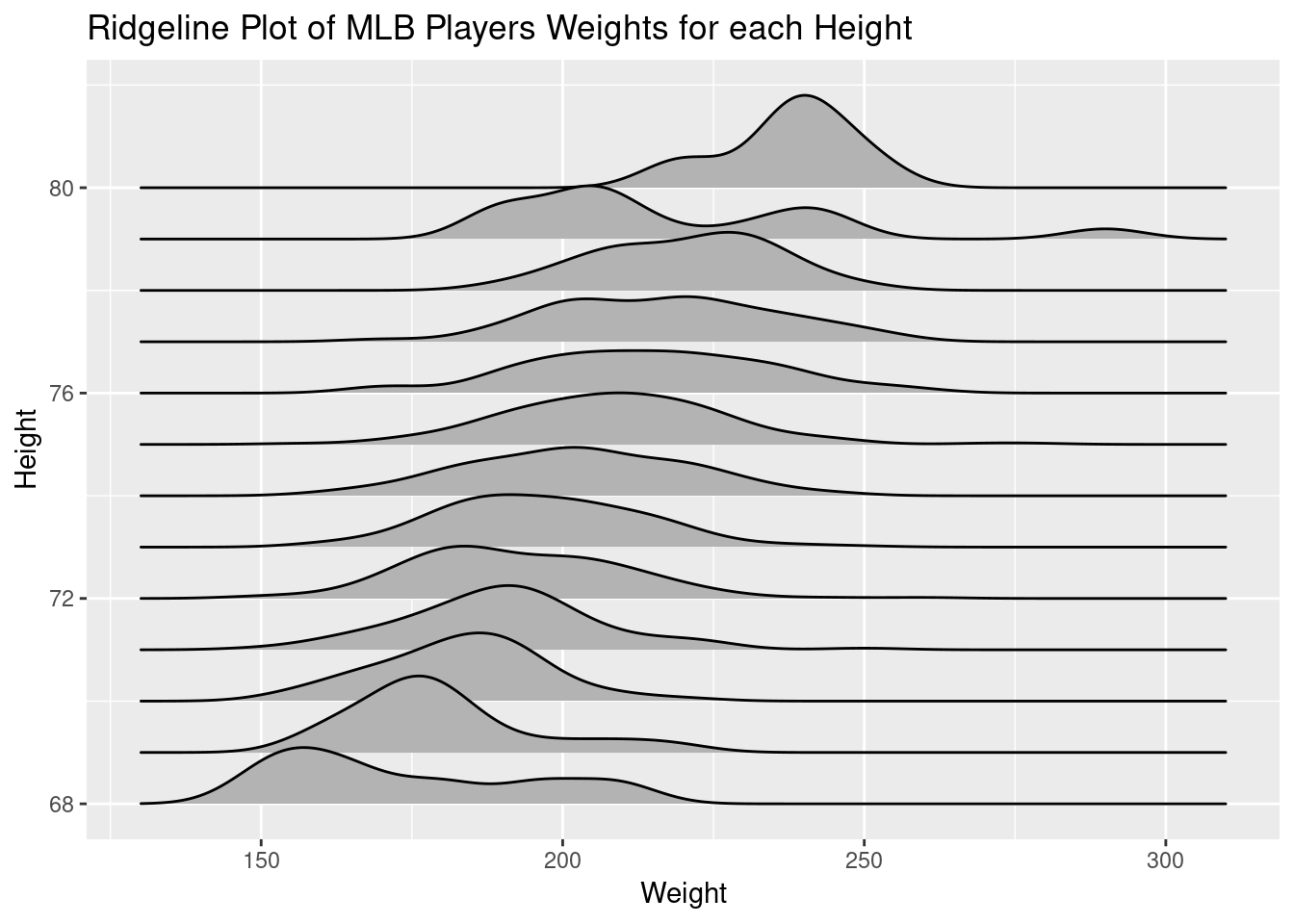
This has the advantage of showing the sample distribution. Few if any of my students had seen such a plot, but seemed to understand what it was showing. I remarked that these seemed pretty normal, for real sample data, right at the end of class and at least one student looked concerned about that.
Comparing with a Normal Sample
To show how normal the data is, I decided to generate sample normal data (via rnorm) with the same mean and standard deviation of weights for each height. First, let’s build the dataframe of conditional means and standard deviations (homoscedasticity is another issue):
mlbNormP <- group_by(mlb, Height) %>%
  summarise(mean=mean(Weight), sd = sd(Weight), n=n()) %>%
  filter(n>4)

knitr::kable(head(mlbNormP))| Height | mean | sd | n |
|---|---|---|---|
| 68 | 173.8571 | 22.08641 | 7 |
| 69 | 179.9474 | 15.32055 | 19 |
| 70 | 183.0980 | 13.54143 | 51 |
| 71 | 190.3596 | 16.43461 | 89 |
| 72 | 192.5600 | 17.56349 | 150 |
| 73 | 196.7716 | 16.41249 | 162 |
I’ve filtered out heights with less than 4 players, mainly for aesthetic purposes. Now for each row of this dataframe, we want to generate a random sample of normally distributed data. This is where purrr::pmap_dfr comes in - which will map (tidyverse version of apply) a function onto a list of input vectors in parallel and bind the results into a dataframe along rows.
mlbNorm<-pmap_dfr(
  list(
    x=mlbNormP$Height, y=mlbNormP$mean,
    z=mlbNormP$sd, w = mlbNormP$n),
  function(x,y,z,w){
    data.frame(Ht=rep(x,100), WtNorm=rnorm(100, y, z))
    })
Here I’m not using the size of our sample of each height, instead using 100 for each height. Now let’s plot both ridge-lines, and color based on the observed (blue) or generated (red) data.
ggplot()+
  geom_density_ridges(data=mlbNorm,
                      aes(y=Ht, x=WtNorm, group=Ht), fill="red", alpha=.3) +
  geom_density_ridges(data=mlb,
                      aes(x=Weight, y=Height, group=Height),
                      fill="blue", alpha=.3)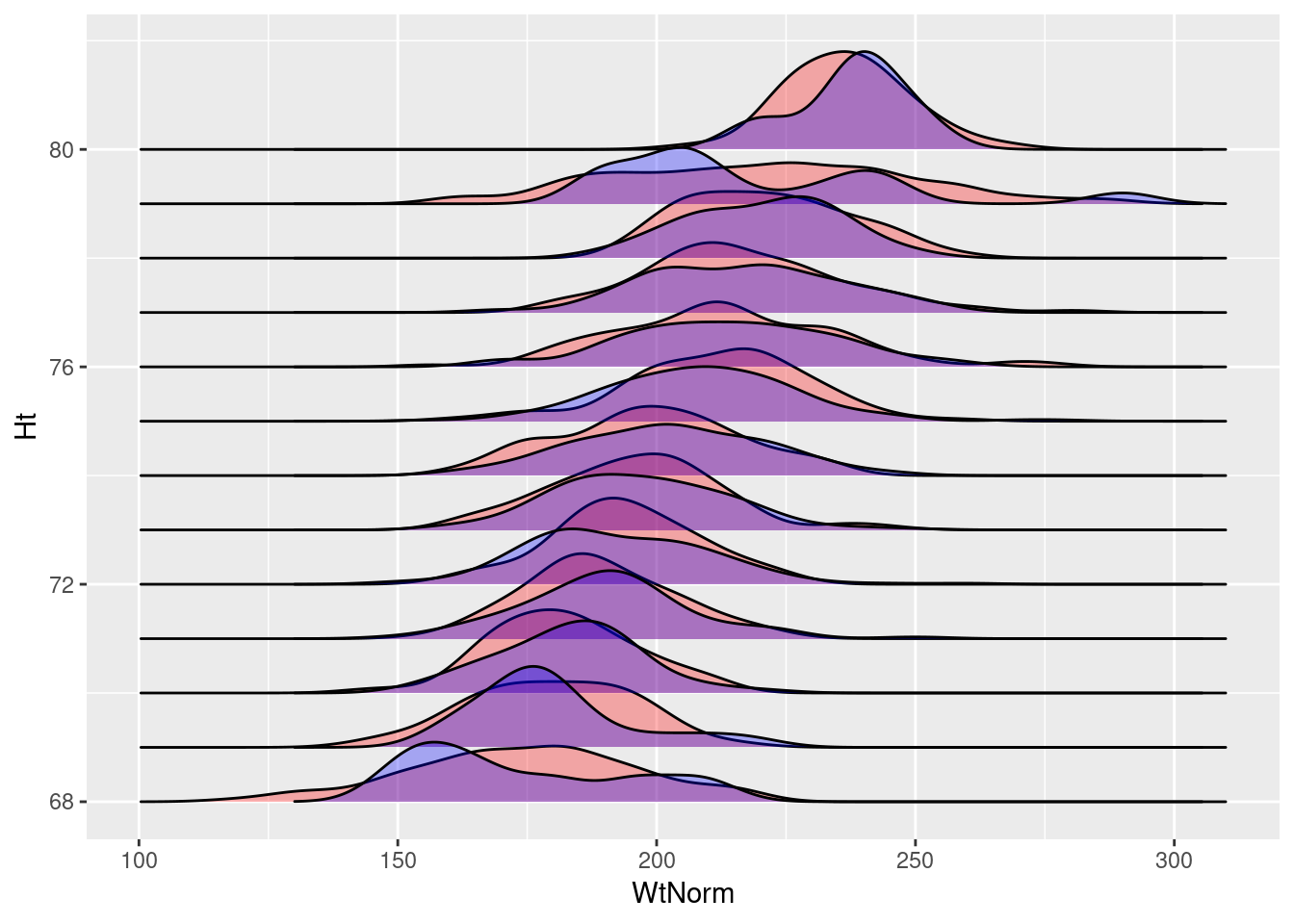
Alternatively, we can take advantage of the size of each sample of observed data:
mlbNorm2<-pmap_dfr(
  list(
    x=mlbNormP$Height, y=mlbNormP$mean,
    z=mlbNormP$sd, w = mlbNormP$n),
  function(x,y,z,w){
    data.frame(Ht=rep(x,w), WtNorm=rnorm(w, y, z))
    })

ggplot()+
  geom_density_ridges(data=mlbNorm2,
                      aes(y=Ht, x=WtNorm, group=Ht), fill="red", alpha=.3) +
  geom_density_ridges(data=mlb,
                      aes(x=Weight, y=Height, group=Height),
                      fill="blue", alpha=.3)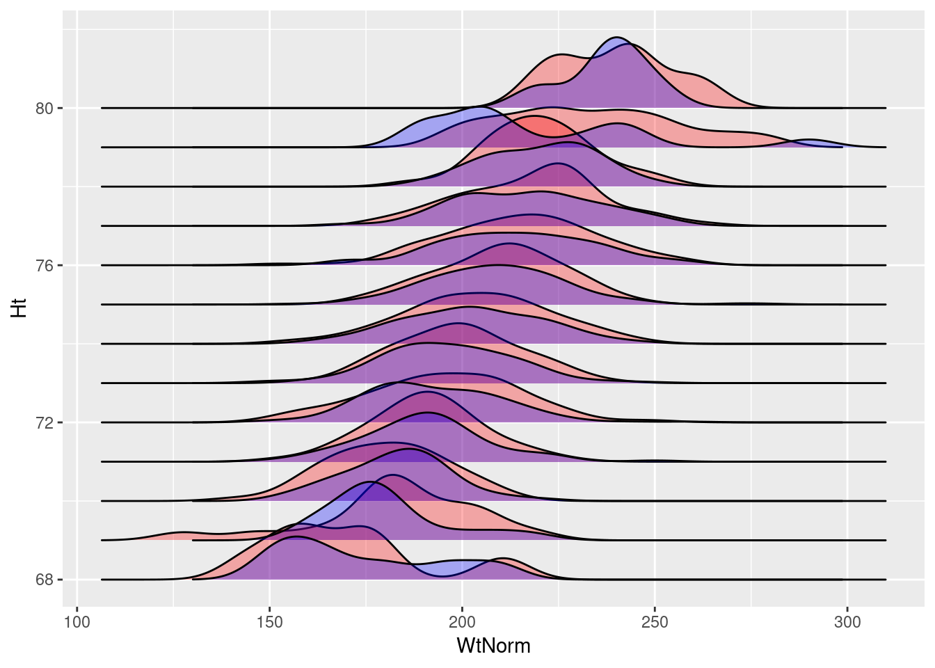
In either case, the generated random normal data is very similar to the actual data in our dataset. This also seems to provide a nice, general method to visualize if this assumption of our linear model is violated by the data.