This post is primarily to give the basic overview of principal components analysis (PCA) for dimensionality reduction and regression. I wanted to create it as a guide for my regression students who may find it useful for their projects. First, let’s note the two main times that you may want to use PCA - dimensionality reduction (reducing variables in a dataset) and removing colinearity issues. These are not exclusive problems, often you want to do both. However, depending on the data, PCA will ensure a lack of colinearity among the principal components but may not be able to use less variables in subsequent models.
Basic Idea
Before getting into real examples, let’s look at what PCA does in 2 dimensions. I’ll generate some highly correlated data and compute the principal components, and we’ll make it easy to predict the components. My data will be related by \(y=3*x+1+\epsilon\), where \(\epsilon\) is normally distributed random error. This means that the greatest variation in my data should be along the line \(y=3x+1\), which should give the first principal component. The second (and final in the 2-D case) will be along the perpendicular line \(y=\frac{-1}{3}x+b\).
library(dplyr) #pipes and df manipulation
library(ggplot2) #graphing
library(patchwork) #graph layout

x <- seq(from=1, to=10, length.out = 100)
rn <- rnorm(100, mean=0, sd=1.25) #random error
y <- 3*x+1+rn
df <- data.frame(x, y)

#compute principal components
pcdf <- prcomp(df)

#graph data and pc's
data.graph <- ggplot(df, aes(x=x,y=y))+geom_point()+
  ggtitle("Original Data")
pc.graph <- ggplot(as.data.frame(pcdf$x), aes(x=PC1, y=PC2))+
  geom_point()+ggtitle("Data in PC-space")

data.graph+pc.graph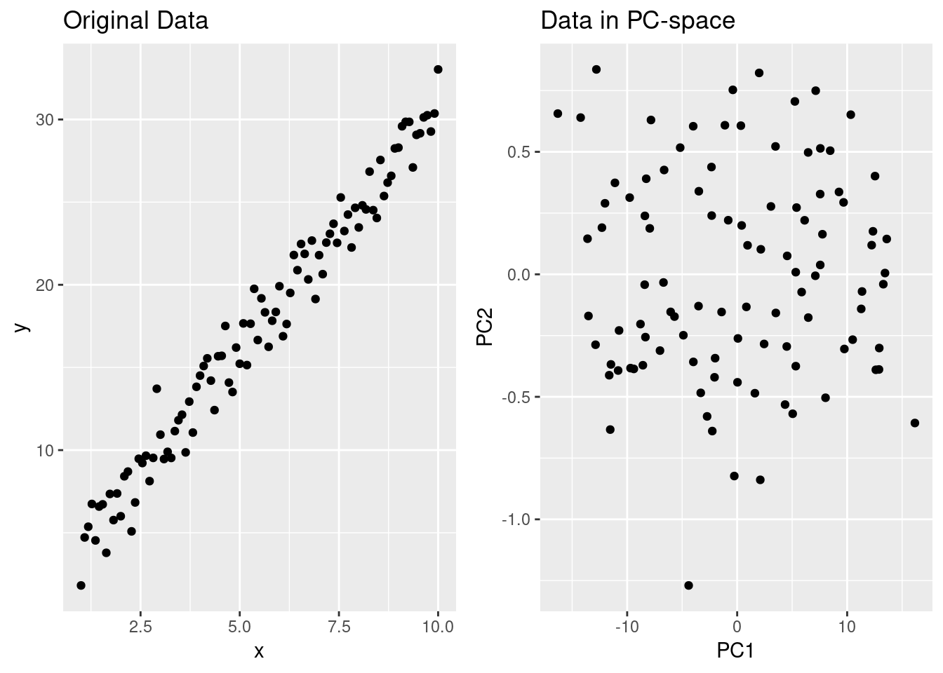
Notice how the correlation between \(x\) and \(y\) vanishes when looking at the data with axes aligned along the principal components - now PC1 and PC2 provide non-colinear data to us in regression. Furthermore, the sdev element of pcdf tells use how much of the standard deviation (and hence variance) is explained by each component:
pcdf$sdev^2/sum(pcdf$sdev^2)## [1] 0.997359167 0.002640833So PC1 accounts for almost all of the variance seen in the original data. This isn’t surprising given how the data was made, it is so highly correlated that the data is basically one-dimensional and PCA has found that. With higher dimensional data, a \(scree~plot\) is useful to see how additional components explain more variance:
ggplot(data.frame(
  component = 1:length(pcdf$sdev),
  explained.var.pct = pcdf$sdev^2/sum(pcdf$sdev^2)
  ),
  aes(x=component, y=cumsum(explained.var.pct)))+
    geom_line()+ylab("Total Percent Variance Explained")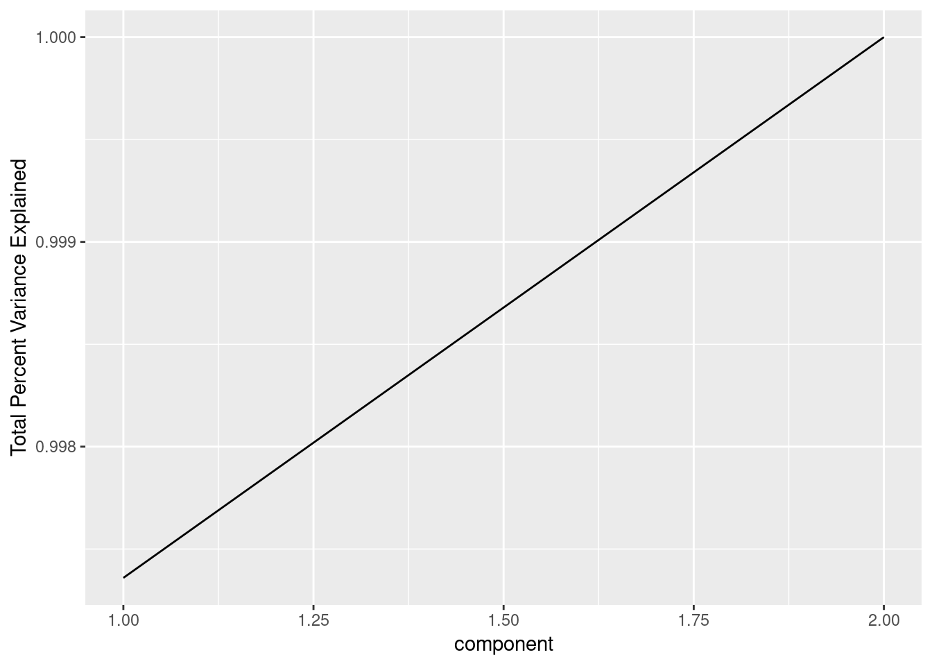
Now, what about the relationship in our data (\(y=3x+1\)) and the principal components? The rotation element of pcdf gives us a matrix of eigenvectors that tells use how to turn a point in the original \(xy\)-plane into a point in the \(PC1PC2\)-plane. The second row of the rotation matrix divided by the first (\(y/x\)) gives use slopes of almost \(3\) and \(\frac{-1}{3}\) (the difference is the random error I’ve added to the data). The principal components are just a new basis (in the linear algebra sense), each column is a unit vector and the columns are orthogonal to each-other, so in two-dimensions the slope determines a unit vector. In higher dimensions this gets more complicated, but the rotation matrix columns still give us the direction vector for the principal components. If you remember multivariate calculus, you can turn a direction vector into a line in higher dimensions.
A Real Example
I’ll load data from sb3tnzv, which has data about the content of certain molecules in a certain species of sagebrush (this is related to a collaboration with a biochemist).
sb <- read.csv("../../static/files/sb3tnzv.csv", header=TRUE)
knitr::kable(head(sb))| id | species | browsed | CYP1A.grouse.micr | CYP1A.human.micr | SB02 | SB03 | SB05 | SB07 | SB09 | SB10 | SB11 | SB12 | SB13 | SB14 | SB15 | SB16 | SB17 | SB18 | SB19 | SB20 | SB22 | SB23 | SB24 | SB26 | SB28 | SB29 | SB30 | SB31 | SB32 | SB34 | SB36 | SB37 | SB38 | SB39 | SB40 | SB41 | SB42 | SB43 | SB44 | SB45 | SB45s | SB46 | SB47 | SB48 |
|---|---|---|---|---|---|---|---|---|---|---|---|---|---|---|---|---|---|---|---|---|---|---|---|---|---|---|---|---|---|---|---|---|---|---|---|---|---|---|---|---|---|---|---|---|
| 105 | 3T | NB | NA | NA | 0.0000 | 629.0214 | 565.9454 | 0 | 0.000 | 1510.473 | 618.7710 | 1389.2164 | 719.0859 | 370.6543 | 0 | 10076.76 | 0.000 | 0 | 26818.27 | 55521.95 | 7762.168 | 7988.484 | 0 | 29838.72 | 0.000 | 0.000 | 0.000 | 0.000 | 0.000 | 0 | 0.000 | 0.00 | 0.000 | 0.000 | 0.000 | 70267.00 | 109853.00 | 0.00 | 60935.48 | 0.00 | 0.000 | 5583.644 | 4029.331 | 76519.95 |
| 134 | 3T | B | NA | NA | 418.1162 | 787.7897 | 649.8425 | 0 | 1825.224 | 0.000 | 749.1660 | 1629.1661 | 815.1082 | 495.5262 | 0 | 13573.21 | 1406.067 | 0 | 29028.81 | 68483.62 | 9038.913 | 9783.465 | 0 | 30501.25 | 10599.994 | 7101.127 | 8305.438 | 0.000 | 4244.354 | 0 | 2289.997 | 13235.83 | 3617.598 | 5641.736 | 5766.007 | 67198.16 | 127896.20 | 71841.00 | 66638.00 | 17905.29 | 0.000 | 4631.608 | 7263.780 | 86716.27 |
| 154 | 3T | NB | 137.2 | 64.3 | 403.1469 | 654.3164 | 565.2982 | 0 | 0.000 | 1808.972 | 650.8421 | 1560.4817 | 1266.7593 | 0.0000 | 0 | 12916.54 | 0.000 | 0 | 37969.62 | 66222.91 | 8011.746 | 8014.458 | 0 | 25759.11 | 6783.765 | 6627.330 | 6373.151 | 0.000 | 4767.672 | 0 | 3078.736 | 15643.33 | 4111.693 | 5938.325 | 16812.998 | 59342.97 | 93693.29 | 69981.00 | 64628.00 | 18887.17 | 0.000 | 5405.461 | 4248.908 | 67234.19 |
| 182 | 3T | NB | 123.5 | 62.9 | 558.8956 | 1044.3494 | 0.0000 | 0 | 2590.590 | 0.000 | 1161.7732 | 1744.6504 | 902.3607 | 0.0000 | 0 | 10598.65 | 1635.713 | 0 | 32982.45 | 67699.61 | 8178.428 | 6533.004 | 0 | 27824.57 | 12031.102 | 6346.032 | 9447.529 | 0.000 | 5135.961 | 0 | 2169.135 | 0.00 | 6862.923 | 6174.927 | 23795.510 | 14001.83 | 20861.51 | 131440.00 | 147611.00 | 20330.75 | 0.000 | 4810.313 | 8282.686 | 80970.20 |
| 222 | 3T | NB | 161.0 | 74.1 | 254.2615 | 431.4813 | 445.9520 | 0 | 0.000 | 1078.684 | 447.0190 | 895.7186 | 594.2125 | 0.0000 | 0 | 16864.11 | 0.000 | 0 | 23013.96 | 47683.07 | 5734.898 | 7296.023 | 0 | 12866.58 | 3783.557 | 4826.480 | 5690.679 | 0.000 | 3626.880 | 0 | 0.000 | 11667.33 | 3201.437 | 5310.534 | 8928.760 | 21563.69 | 44012.07 | 20978.52 | 34732.02 | 0.00 | 7606.205 | 0.000 | 11376.954 | 25991.20 |
| 238 | 3T | B | 132.4 | 72.9 | 0.0000 | 668.8263 | 0.0000 | 0 | 0.000 | 854.496 | 332.0903 | 652.6357 | 99.0683 | 0.0000 | 0 | 22382.95 | 0.000 | 0 | 25243.57 | 68834.52 | 9652.101 | 6982.520 | 0 | 42749.88 | 0.000 | 4809.935 | 6726.340 | 4758.589 | 0.000 | 0 | 2101.150 | 0.00 | 3842.604 | 4641.517 | 15705.387 | 51669.16 | 90192.88 | 63978.74 | 88519.23 | 24585.34 | 0.000 | 5925.326 | 3597.326 | 88216.69 |
Each of the SB variables basically tells you how much of the molecule is in the sample and each number corresponds to a different molecule. Hopefully PCA will help reduce the number of variables. Let’s perform the PC computation and look at a scree plot.
sbpc <- prcomp(sb[,6:45], center = TRUE, scale. = TRUE)

ggplot(data.frame(
  component = 1:length(sbpc$sdev),
  explained.var.pct = sbpc$sdev^2/sum(sbpc$sdev^2)
  ),
  aes(x=component, y=cumsum(explained.var.pct)))+
    geom_line()+ylab("Total Percent Variance Explained")+
    ggtitle("Scree Plot of Sagebrush Data")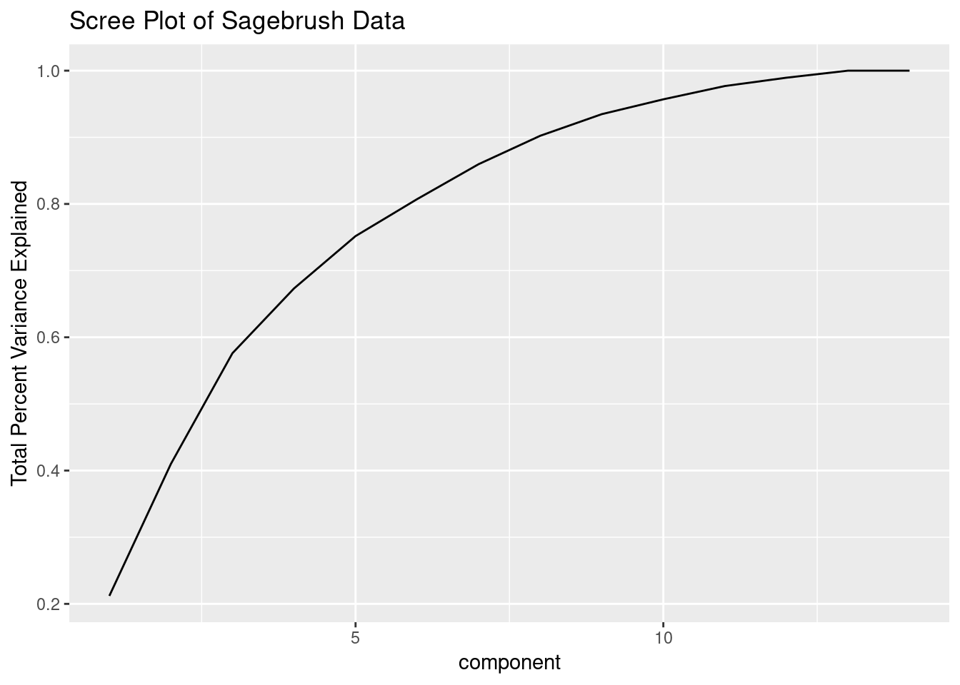
This shows that we can explain most of the variation in our data with far fewer variables than all the SB’s. It’s worth noting that I’ve removed all variables with zero variance already and am scaling and centering the data prior to performing the PCA computation - this is needed whenever different variables have vastly different scales.
We can now go about building models using the principal components instead of the original SB variables and we don’t have to worry about colinearity. Furthermore, the order of our components is in order of decreasing variance explained so we would build models using the PC’s in order (i.e. a model without PC1 but with other PC’s would be strange). The SB variables lack this aspect, but are more interpretable.