I’ve been focusing on python recently to become a bi-lingual data scientist. Probably my least favorite thing about python is its plotting libraries - there are too many options built on top of matplotlib which pre-dates pandas dataframes. This makes for some clunky code and blurry boundaries (both “is that a seaborn, pandas, or matplotlib function?” and situations with 3 equally messy solutions but in very different ways). In my opinion, ggplot2’s deep interplay with dataframes makes a lot more sense and ggplot’s layers make it easy to change plot type (just switch the geom_), add facets, and tweak aesthetics. I think this post does a great job comparing the main python plotting libraries and also illustrates why matplotlib turns me off a bit - too many loops!
Despite matplotlib’s issues, it can make some really nice plots! Today I’ll be doing a little mapping so show off it’s prettier side.
Data
The data I’ll be using is of the places I’ve lived - GPS coordinates of 9 cities in 7 states (for security reasons I’m omitting where I was born). I’m going to use R’s maps package to get most of the data (because it’s soooo easy).
library(dplyr)
library(ggplot2)
library(maps)

cities <- filter(maps::us.cities, name %in% c("Reno NV", "Sacramento CA", "Salt Lake City UT", "Tacoma WA", "Boise ID", "Tulare CA", "Harrisonburg VA", "Charlotte NC", "Seattle WA"))
This dataframe was saved to a .csv for later use. The rest will be in python to draw a pretty map, overlay some points and connect the points with great circles.
Basemap
There are two main ways I know of to draw maps in python: matplotlib’s basemap toolkit and geopandas. As you might expect, geopandas is generally a lot nicer to use, but can be limiting. I’m going to use basemap since most of the data I need to plot is just to get the background map drawn and basemap has that built in (no shapefiles or extra datasets).
First, we’ll load our python libraries and set-up the underlying map.
import pandas as pd
import matplotlib.pyplot as plt
import matplotlib as mpl
from mpl_toolkits.basemap import Basemap
m = Basemap(llcrnrlon=-130.,llcrnrlat=20.,urcrnrlon=-60. , urcrnrlat=50., rsphere=(6378137.00,6356752.3142),
            resolution='l',projection='merc',
            lat_0=35.,lon_0=-95.)
m.drawcoastlines()
m.drawstates()
m.drawcountries()
m.fillcontinents()
plt.title("The US")
plt.show()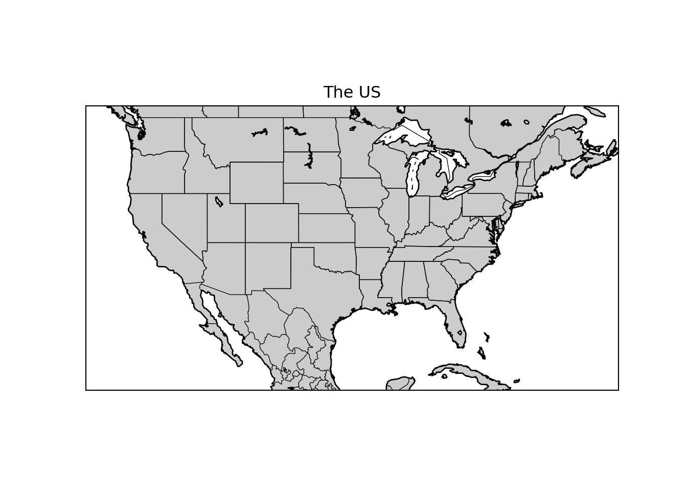
The Basemap command has many options, here I’ve set the lower-left corner and upper-right corner, the Mercator projection, low resolution, and a center of \(35^{\circ}N\), \(95^{\circ}W\). This will include the first 48 states of the US roughly centered. Then we add coastlines, states, countries, and fill the land. These last commands are what makes Basemap nice - I don’t need shapefiles or other data to get all this detail onto the map.
Adding Points
Now I can add points for the cities. First, I’ll load the dataframe of the gps data and build lists of the order in which I moved.
city = pd.read_csv('../../static/files/city-gps2.csv')
print(city.head())
#lists of longitude and latitude in order.
## name pop lat long
## 0 Boise ID 193628 43.61 -116.23
## 1 Charlotte NC 607111 35.20 -80.83
## 2 Harrisonburg VA 41992 38.44 -78.87
## 3 Reno NV 206626 39.54 -119.82
## 4 Sacramento CA 480392 38.57 -121.47clon = [city.long[3], city.long[8], city.long[4],
city.long[7], city.long[5], city.long[1],
city.long[6], city.long[7], city.long[2],
city.long[0]]
clat = [city.lat[3], city.lat[8], city.lat[4],
city.lat[7], city.lat[5], city.lat[1],
city.lat[6], city.lat[7], city.lat[2],
city.lat[0]]Next, we add these points ((clon,clat) pairs) to the earlier basemap.
x,y = m(clon, clat)
m.scatter(x,y,marker='*', color='r', zorder=5) #the zorder is important
plt.show()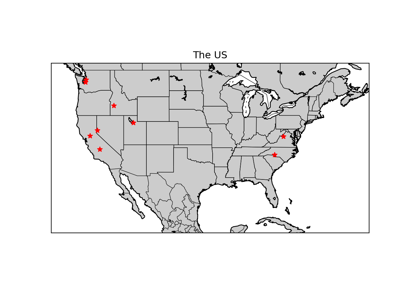
Connecting the Points
Now we can connect the points. If I were really bored, I could trace out the actual paths driven to get from one place to another. I’m not, so I’m just going to use Basemap’s drawgreatcircle() method to connect points with a great circle. This is why having the lists of latitude and longitude was really done.
for i in range(0,len(clon)-1):
    m.drawgreatcircle(clon[i],clat[i],clon[i+1],clat[i+1],linewidth=4,color='b')
plt.title("Places Lived with Great Circle Moves")
plt.show()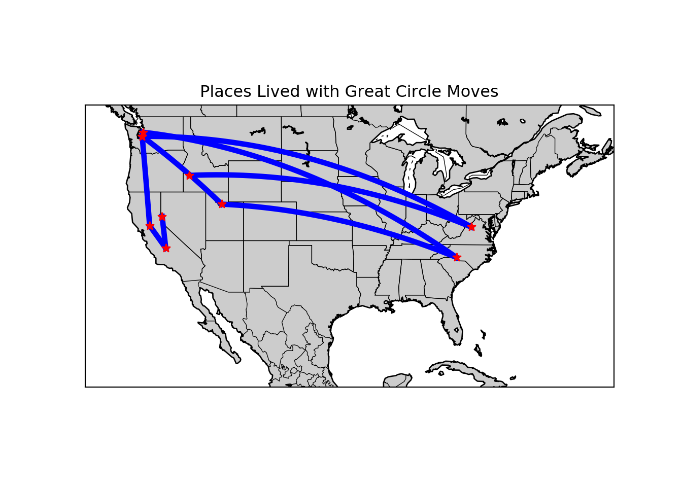
Not bad, but adding an alpha setting to change transparency based on the order of moves helps. The earliest move will be at \(1/3\) (light, but visible) while the most recent will be \(1\), with a linear increment. I’m also going to close the old plot and put all the mapping code together here.
plt.close()
m = Basemap(llcrnrlon=-130.,llcrnrlat=20.,urcrnrlon=-60. , urcrnrlat=50., rsphere=(6378137.00,6356752.3142),
            resolution='l',projection='merc',
            lat_0=35.,lon_0=-95.)
m.drawcoastlines()
m.drawstates()
m.drawcountries()
m.shadedrelief()
x,y = m(clon, clat)
m.scatter(x,y,marker='*', color='r', zorder=5)
for i in range(0,len(clon)-1):
    m.drawgreatcircle(clon[i],clat[i],clon[i+1],clat[i+1],linewidth=4,color='b', alpha=((1/3)+i*(2/27)))
plt.title("Places Lived with Great Circle Moves")
plt.show()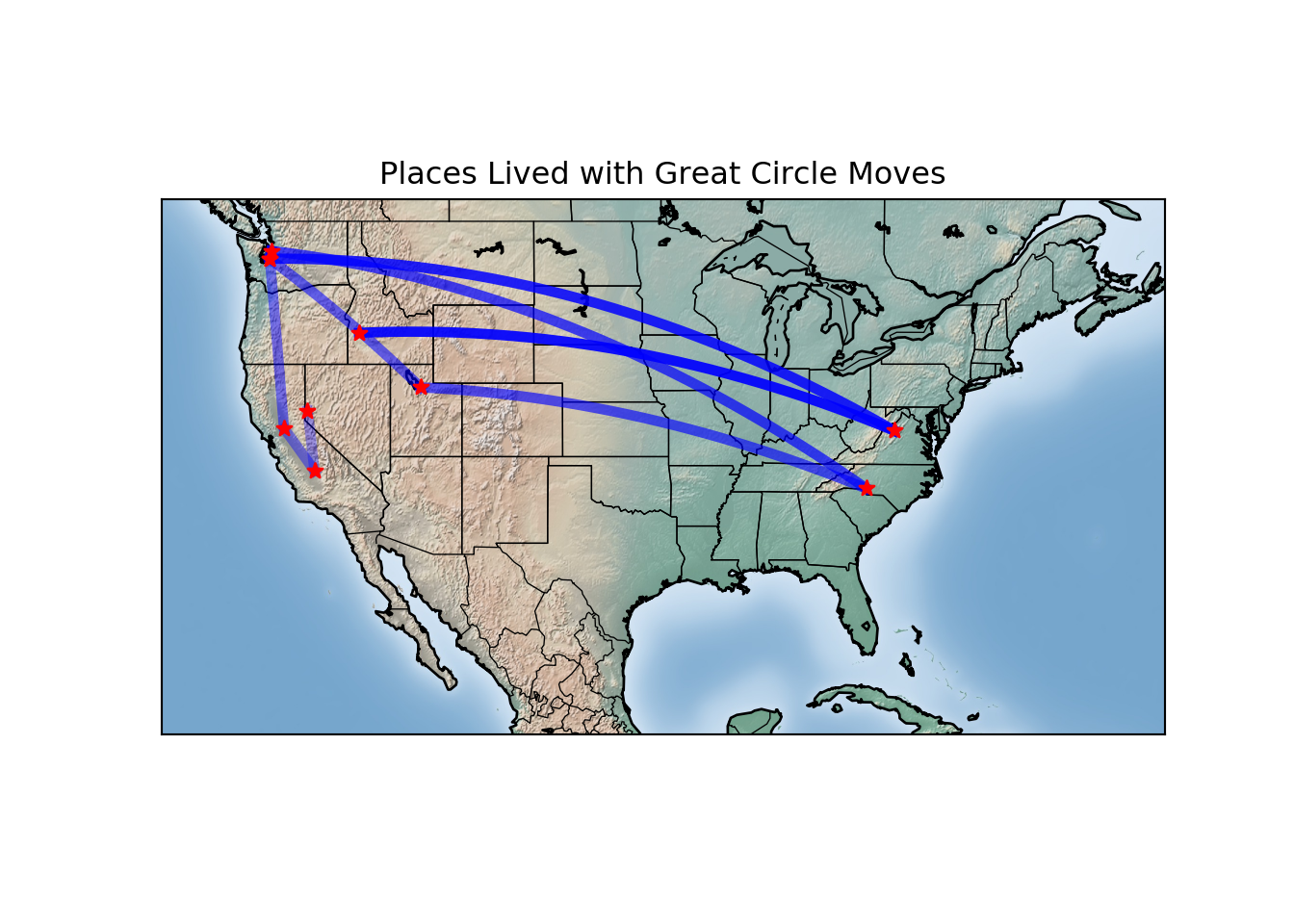
You may have noticed that I used .shadedrelief() instead of .fillcontinents(). Basemap has several similar options to provide some real quality to maps. Here are the .etopo() and .bluemarble() options as well:
plt.close()
plt.subplot(1,2,1)
m2 = Basemap(llcrnrlon=-130.,llcrnrlat=20.,urcrnrlon=-60. , urcrnrlat=50., rsphere=(6378137.00,6356752.3142),
            resolution='l',projection='merc',
            lat_0=35.,lon_0=-95.)
m2.drawcoastlines()
m2.drawstates()
m2.drawcountries()
m2.bluemarble()
x,y = m2(clon, clat)
m2.scatter(x,y,marker='*', color='r', zorder=5)
for i in range(0,len(clon)-1):
    m2.drawgreatcircle(clon[i],clat[i],clon[i+1],clat[i+1],linewidth=4,color='b', alpha=(.3+i*(2/27)))
plt.subplot(1,2,2)
m3 = Basemap(llcrnrlon=-130.,llcrnrlat=20.,urcrnrlon=-60. , urcrnrlat=50., rsphere=(6378137.00,6356752.3142),
            resolution='l',projection='merc',
            lat_0=35.,lon_0=-95.)
m3.drawcoastlines()
m3.drawstates()
m3.drawcountries()
m3.etopo()
x,y = m3(clon, clat)
m3.scatter(x,y,marker='*', color='r', zorder=5)
for i in range(0,len(clon)-1):
    m3.drawgreatcircle(clon[i],clat[i],clon[i+1],clat[i+1],linewidth=4,color='b', alpha=(.3+i*(2/27)))
plt.show()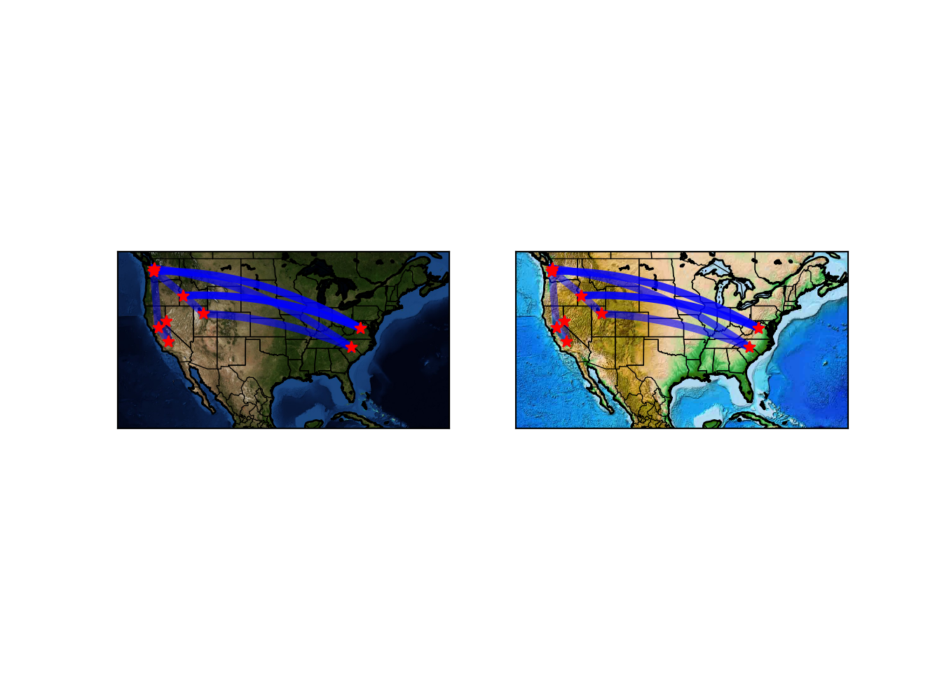
It’s no ggplot2, but very nice for an 800 pound gorilla*.