Every time there’s news about a mass shooting I feel like doing some type of data analysis about gun violence. With the shootings in Dayton and El Paso, as well as news of several likely shootings being prevented, I thought I would actually follow through with some analysis. Having been a senior in high school (in California) when the Columbine shooting took place, and also living in Salt Lake during the Trolley Square shooting I’ve seen the impacts of these tragedies and feel as though they are happening more frequently. This seemed like a natural thing to quantify: have mass shooting become more common or more severe?
Data Exploration
Mother Jones maintains a dataset on mass shootings, and there are many other datasets related to gun violence in general. I’m going to focus on the mass shooting data for this post. First, we’ll load the standard python packages and read in the data:
import numpy as np
import pandas as pd
import matplotlib.pyplot as plt
import seaborn as sns

sns.set_style('ticks')
sns.set_context("paper")

ms = pd.read_csv('../../static/files/MJ-mass-shoot.csv', parse_dates=[2])
ms.info()
## <class 'pandas.core.frame.DataFrame'>
## RangeIndex: 114 entries, 0 to 113
## Data columns (total 24 columns):
## case 114 non-null object
## location 114 non-null object
## date 114 non-null datetime64[ns]
## summary 114 non-null object
## fatalities 114 non-null int64
## injured 114 non-null int64
## total_victims 114 non-null int64
## location.1 114 non-null object
## age_of_shooter 114 non-null int64
## prior_signs_mental_health_issues 114 non-null object
## mental_health_details 114 non-null object
## weapons_obtained_legally 114 non-null object
## where_obtained 114 non-null object
## weapon_type 114 non-null object
## weapon_details 114 non-null object
## race 114 non-null object
## gender 114 non-null object
## sources 114 non-null object
## mental_health_sources 114 non-null object
## sources_additional_age 114 non-null object
## latitude 114 non-null float64
## longitude 114 non-null float64
## type 114 non-null object
## year 114 non-null int64
## dtypes: datetime64[ns](1), float64(2), int64(5), object(16)
## memory usage: 21.5+ KBIn my transition from R to Python, I’ve missed the basic variable info of RStudio and the info() call on a pandas dataframe at least gives the basic type data for each variable.
I’m interested in frequency and severity of these shootings, so let’s first look at fatalities over time:
ms.plot(x='date', y='fatalities')
plt.ylabel('Fatalities')
plt.title('Mass Shooting Fatalities')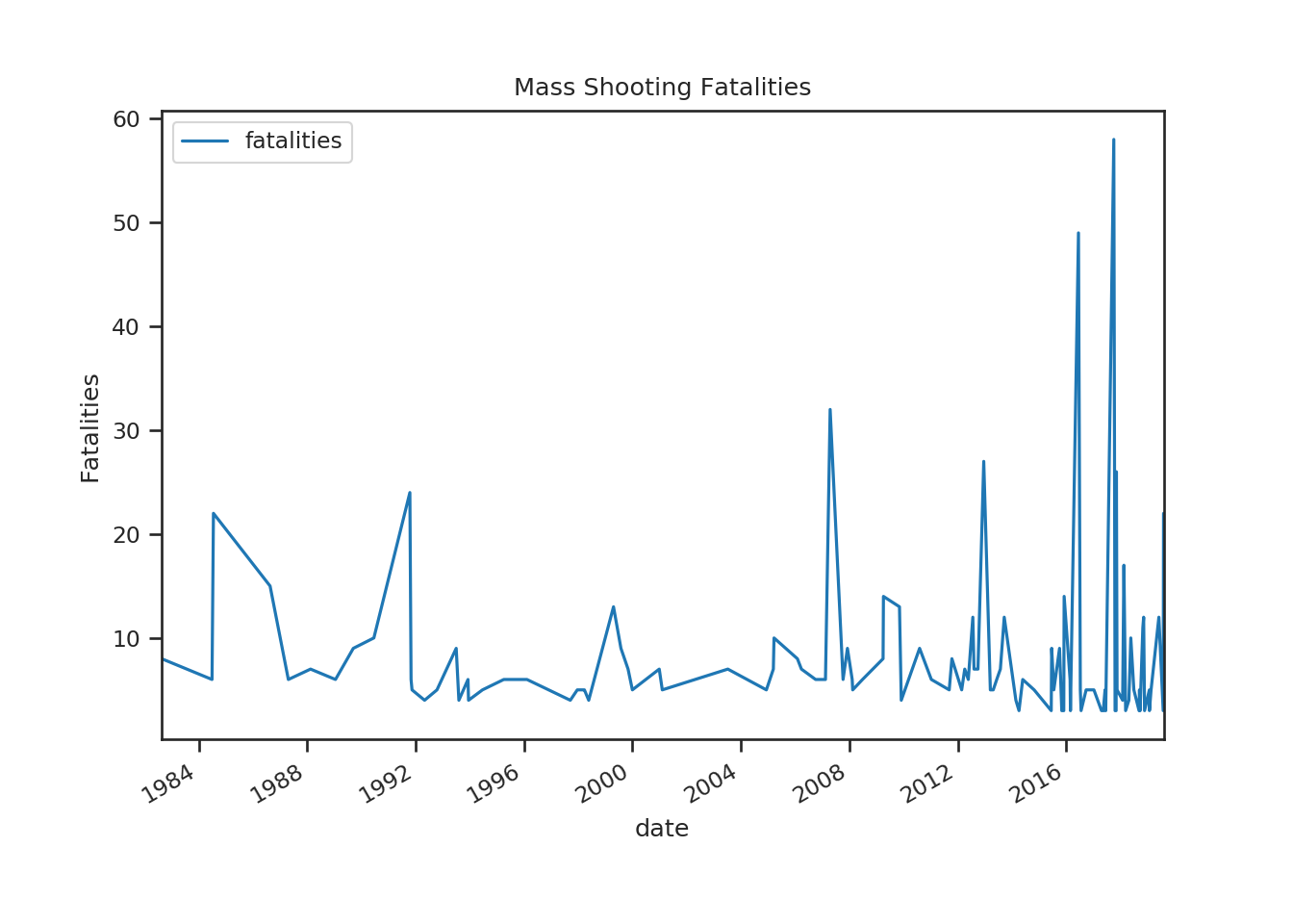 I would have also looked at injuries, but the Las Vegas shooting of 2017 makes a plot of both unreadable. The above plot does indicate both a frequency and severity increase.
To investigate change over time, I’m going to group the data by year and aggregate some of the features.
annualized = pd.DataFrame(ms.groupby('year').case.agg('count'))
annualized.columns = ['count']
annualized['total_fatalities'] = ms.groupby('year').fatalities.agg('sum')
annualized['total_injuries'] = ms.groupby('year').injured.agg('sum')
annualized['total_victims'] = ms.groupby('year').total_victims.agg('sum')
annualized['fatalities_per_shooting'] = annualized.total_fatalities/annualized['count']
annualized['mean_fatality_rate'] = annualized['fatalities_per_shooting']/annualized['total_victims']
annualized['mean_shooter_age'] = ms.groupby('year').age_of_shooter.agg('mean')
annualized.head()
## count total_fatalities ... mean_fatality_rate mean_shooter_age
## year ...
## 1982 1 8 ... 0.727273 51.0
## 1984 2 28 ... 0.291667 40.0
## 1986 1 15 ... 0.714286 44.0
## 1987 1 6 ... 0.300000 59.0
## 1988 1 7 ... 0.636364 39.0
##
## [5 rows x 7 columns]With this dataframe, I can now look at some of the aggregated data.
annualized = annualized.reset_index()
fig = plt.figure()
ax1 = fig.add_subplot(121)
annualized.plot(x='year', y=['total_fatalities', 'fatalities_per_shooting'], ax=ax1)
ax1.set_ylabel('Fatalities')
ax2 = fig.add_subplot(122)
annualized.plot(x='year', y='count', ax=ax2)
ax2.set_ylabel('Number of Shootings')
plt.show()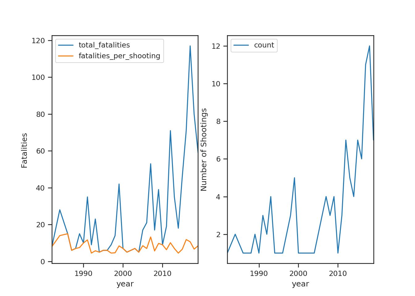 The relatively flat
 fatalities_per_shooting line seems to indicate that the severity increase is largely coming from an increase in the number of mass shootings as opposed to each shooting being more severe (some type of upward trend). The count graph is separate because of it’s much smaller scale, but it’s shape and pattern look very similar to the total_fatalities line. The count graph makes it seem that the frequency of mass shootings has increased. Before getting into any serious analysis, let’s make sure that we have data for each year:
print(set(range(1982, 2020)).difference(set(annualized.year)))

#fill in the 3 years with no shootings
## {1985, 2002, 1983}no_shoot = pd.DataFrame({'year':[1983, 1985, 2002]})
annualized = annualized.merge(no_shoot, on='year', how='outer')
annualized = annualized.reset_index(drop=True).fillna(0)
annualized = annualized.sort_values('year')Change Point Introduction
It seems fairly reasonable to assume that the number of mass shootings in the US in a year should be Poisson distributed. The Poisson distribution models “small” count data over time or space and has been used to describe deaths from horse-kick in the Prussian Cavalry, the number of tornadoes in a year, the number of wrongful convictions in a year (Poisson’s original use of the distribution), the number of visitors to a website, or aphids on a leaf. It is characterized by a single rate parameter that describes how frequently these events occur “on average”. If mass shootings have become more frequent, then there would a rate at which they occurred for a period of time, followed by a new rate for another period of time. This change is a “change point” and we would like to (a) determine if a change point took place (and when) and (b) what the rates before and after the change point are.
Prior to 2010, the count of mass shooting graph seems like the same Poisson rate is likely driving things, so it’s reasonable to look for a single change point. To find the change point and estimate the rates on either side, I’m going to use a Bayesian model and pymc3, which I developed some familiarity with when developing my Insight project. There are also numerous examples of this type of model looking at coal mine accident data.
Mass Shooting Model
Building a Bayesian model for change points requires a prior on when the changepoint is, priors on the rate before and after, and a Poisson likelihood using these rates and observed data. In pymc3, this is done as follows:
import pymc3 as pm

with pm.Model() as cpm:
    T = pm.Uniform('changepoint', 1982, 2019)
    rates = pm.HalfNormal('rate', sd=5, shape=2)
    idx = (annualized['year'].values > T)*1
    count_obs = pm.Poisson('count_obs', mu=rates[idx], observed=annualized['count'].values)
    step =  pm.Slice()
    trace = pm.sample(step=step, cores=4, progressbar=False, random_state=57)
Here, \(T\) is the possible change point, uniformly distributed over interval from 1982 to 2019. Each rate is assumed to have the same shape, the positive half of a normal distribution with mean 0 and standard deviation 5. The shape=2 parameter creates a length 2 array of rates. The idx variable is an index for the rates array, either 0 or 1 depending on whether data is from before or after the change point. The likelihood is build by the count_obs variable and the next two lines build the posterior distribution via a Slice step-sampler (as opposed to the default NUTS).
Model Diagnostics
Whenever you do MCMC, you need to check convergence. The two simplest ways in pymc3 are (a) a traceplot and (b) posterior summary. The traceplot plots the trace object that was just created. Each of the MCMC chains graphed should show similar structure on the left and we should not see patterns or autocorrelation in the “fuzzy caterpillars” on the right.
pm.traceplot(trace)## array([[<matplotlib.axes._subplots.AxesSubplot object at 0x7f372eefa190>,
## <matplotlib.axes._subplots.AxesSubplot object at 0x7f372ee4f450>],
## [<matplotlib.axes._subplots.AxesSubplot object at 0x7f372ee7fe90>,
## <matplotlib.axes._subplots.AxesSubplot object at 0x7f372ee0ca10>]],
## dtype=object)plt.show()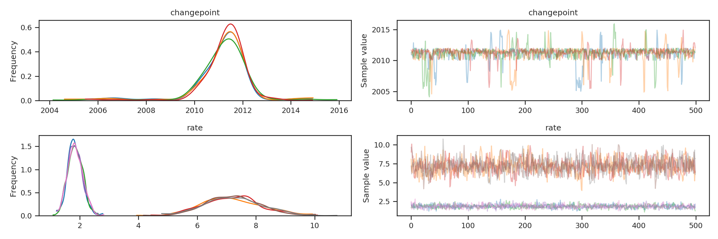
The posterior summary provides means, standard deviations, and high density intervals for each variable in our posterior, as well as an Rhat value (which should be close to 1 for convergence). This provides both some diagnostic info, and the start our our inference from the posterior sample.
trace_summ = pm.summary(trace)## /usr/lib/python3.7/site-packages/pymc3/stats.py:982: FutureWarning: The join_axes-keyword is deprecated. Use .reindex or .reindex_like on the result to achieve the same functionality.
## axis=1, join_axes=[dforg.index])library(reticulate)
library(knitr)
kable(py$trace_summ)| mean | sd | mc_error | hpd_2.5 | hpd_97.5 | n_eff | Rhat | |
|---|---|---|---|---|---|---|---|
| changepoint | 2011.148295 | 1.1784383 | 0.0490107 | 2009.995179 | 2014.808750 | 469.4743 | 1.0012466 |
| rate__0 | 1.844826 | 0.2490664 | 0.0062827 | 1.380820 | 2.339726 | 1534.3652 | 0.9994486 |
| rate__1 | 7.201112 | 0.9717701 | 0.0288860 | 5.332041 | 9.067021 | 1163.6754 | 0.9994642 |
Results
The above summary shows the change point was likely in early 2011, and the rate before was just under 2 mass shootings per year to about 7 after. The high probability density intervals (Bayesian analogs of confidence intervals) show that there is a \(95\%\) probability the change point is between early 2010 to late 2012, early rate is between \(1.39\) and \(2.37\) and the late rate is between \(5.2\) and \(8.86\). The interpretation of these is more direct, and positive, than the frequentist confidence interval. PyMC3 also provides several ways to visualize the posteriors and I like the plot_posterior function:
pm.plots.plot_posterior(trace)## array([<matplotlib.axes._subplots.AxesSubplot object at 0x7f37322f2ed0>,
## <matplotlib.axes._subplots.AxesSubplot object at 0x7f372ed7ac10>,
## <matplotlib.axes._subplots.AxesSubplot object at 0x7f372e672510>],
## dtype=object)plt.show()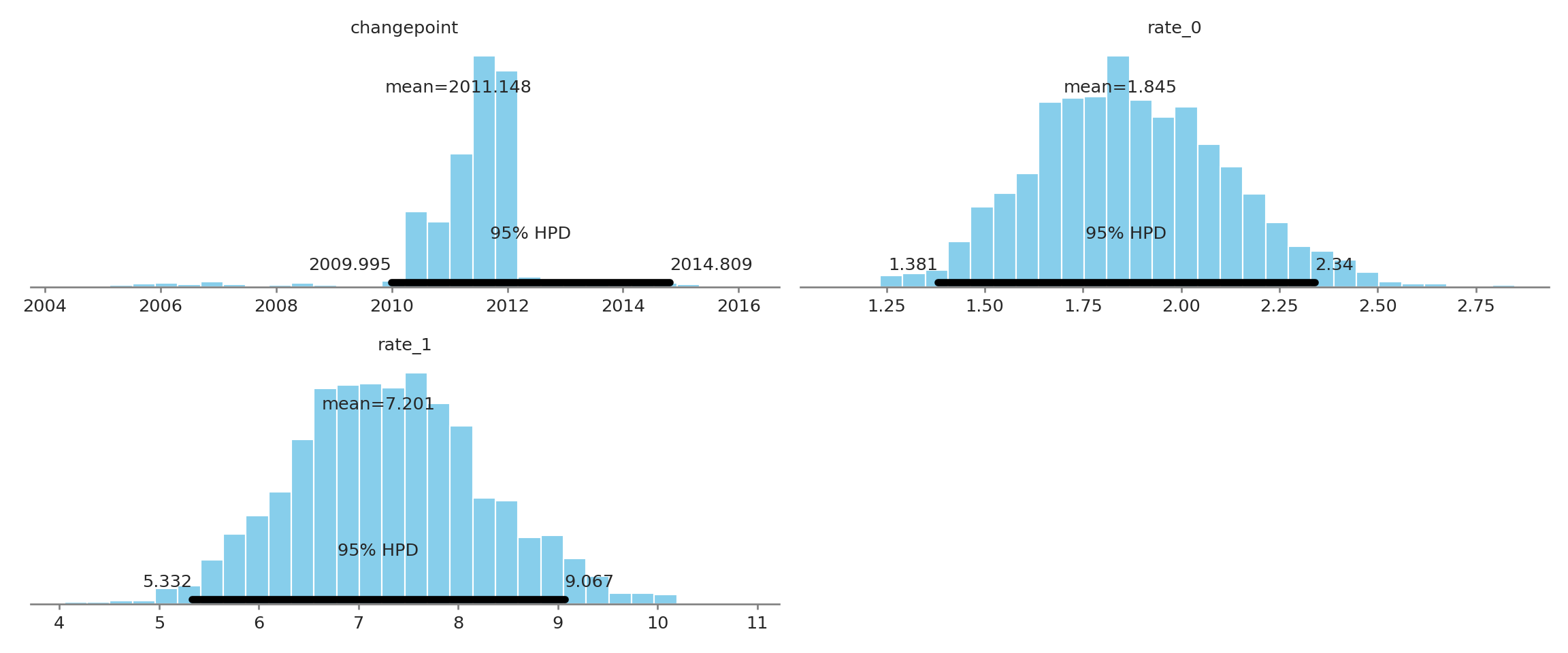
The skewness of the changepoint posterior means the mean is lightly lower than the MAP value, but early to mid-2011 is most likely the point in time the rate change took place. Considering the convergence and clear difference of the rates (\(\sim 2\) to \(\sim 7\)) it seems that a major change has taken place. Explaining why, and especially identifying underlying sociological causes of this change is important research that I’m sure people are investigating. Hopefully it doesn’t just rather dust in academic journals.